Tuesday, November 29, 2016

Year 11 Term 2 - Nosferatu: An Analysis of Horror

Horror has been a staple genre in films for many years, going all the way back to the silent era of films. It is arguably the most popular genre of film of all time, spanning different time periods and even cultures. Despite inducing fear and terror and maybe even trauma, people continue to be to entertained by this frightful genre. While classic horror films typically feature undead, supernatural beings such as as the main villain, sometimes monsters, humans and even aliens can become the antagonist. Even tyres can be something to be afraid of. But, no matter what time period, culture, or antagonist, horror films have one goal: to make the viewer feel scared. While we might think that horror films at the time aren't as terrifying as they are now, they surely were to the people who first watched them.
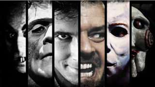
Horror films typically feature a villain with malicious
intent bent on killing the protagonists.
Image courtesy of nofilmschool.com
Nowadays, horror films are typically divided into 3 main sub-genres: psychological, slasher, and gothic. Psychological horror films usually have the most supernatural elements to them, as they want to have a 'psychological' impact on the viewer, using emotions such as fear, guilt, and paranoia and effects such as sounds, lighting, mise-en-scene, and character designs to keep them scared even after the film is over. One popular example of a psychological horror is The Ring (2002). Slasher films, on the other hand, focus more on a psychopathic killer who goes on murdering people in violent ways, and therefore contain aspects of gore. They aren't as mentally scarring as psychological horror films, but can still be quite disturbing. Examples include Friday the 13th (1980), Halloween (1978), and A Nightmare on Elm Street (1984). Finally, we have gothic horror films. They combine elements of death, horror, and often romance. The typical conventions of a gothic horror include a gloomy setting, supernatural beings, curses, prophecies, damsels in distress, etc. The most well known gothic horror films were made by Universal Studios in the 1920s to the 1950s, with the collection of these films usually referred to as "Universal Horror".

One particularly famous example of a gothic horror film is Nosferatu, eine Symphonie des Grauens (1922), also known as Nosferatu: A Symphony of Horror, or simply Nosferatu. It is an unauthorised adaption of Bram Stoker's novel Dracula, directed by Friedrich Wilhelm Murnau, and produced by Prana Studio. The film stars Max Schreck as Count Orlok, the main vampire in the film. To avoid copyright infringements, Murnau made several changes to the characters' names, settings, and even the story to some extent. Ultimately, the studio was forced to file for bankcruptcy because they were sued and all copies of the film were ordered to be destroyed. Fortunately however, some copies have survived to this day and were restored, and the film itself is considered to be a classic.
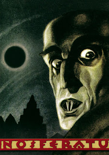
An original 1922 poster of Nosferatu, taken from traileraddicts.com
Nosferatu is known for being a German Expressionist film, where conventions that started outside of Germany are rejected, and the reality within the movie is shown to be heavily distorted, with wild aesthetics. The movement started due to Germany's rejection of foreign films. The film is also known for using real locations rather than exaggerated sets. The film also uses iris lenses for shooting dark scenes, as cameras at the time did not work well in the dark. Therefore, the film shot night scenes in the day, while trying to make it look like it was night. Being a silent film, Nosferatu uses intertitles to show dialogue as well as narration. The effect of the intertitle may vary from person to person, but it may add suspense to the film as it can create short pauses during tense scenes, but they may also reduce suspense since they take the viewer out of the film for a second. The intertitles in Nosferatu tend to be short and only contain a few words, unless it is a narration, where it becomes very descriptive.
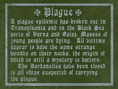
A very descriptive intertitle that appears in the film
The word "Nosferatu" is, in fact, made up for the film. While it is presented as a Romanian word synonymous with "vampire", there is no such word in the Romanian language. However, some theories suggest that the word does indeed have some Romanian origin to it. Some people suggest that the word may have been derived from or misinterpreted from the Romanian words "nesuferitu" and "necurat", meaning "the unclean" and "the insufferable" respectively. Because vampires are considered to be "unholy spirits", these possibilities make sense. The word may also stem from the Greek "Nosophoros", meaning bringer of plague, as in the film Count Orlok spreads the plague with him everywhere he goes.

Because of how early in film history it was produced in, Nosferatu is considered to be an archetype of the vampire genre and even the horror genre as a whole. It defined various aspects of vampires that later films would follow, and we can see various conventions that are present in this film commonly found in modern horror films. One of the most iconic scenes in Nosferatu being the scene where Count Orlok climbs the stairs to Ellen's room and his shadow is cast on to the wall.
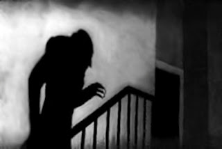
The scene towards the end of the film as Orlok approaches Ellen.
This technique has been used time and time again to show the villain approaching one of the protagonists, usually in a helpless state. This technique is also done at the beginning of the film where the Count approaches Hutter in his room.
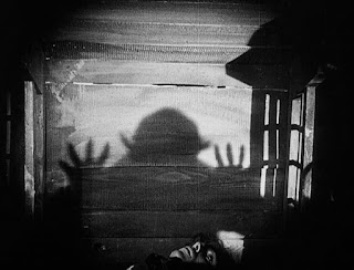
Orlok's shadow cast on the wall while Hutter hides helplessly at the bottom of the frame.
The above shot also happens to be a subjective shot, since we are seeing it from Orlok's point of view. It creates a sense of dread and terror as he approaches Hutter.

We can assume that Nosferatu is a gothic horror film, as it does have elements of goth, curses, prophecies and even a damsel in distress. It can't be a slasher since the Count does not go on a violent killing spree, and it also can't be a psychological horror since it doesn't leave a psychological impact on the viewer (at least in modern times).  Therefore, Nosferatu is a gothic horror.

It is easy to spot some common tropes and conventions of modern horror films in this film. For example, Nosferatu may have popularised the idea that sunlight is deadly to vampires, and doesn't just weaken them like in Bram Stoker's Dracula. Another trope of the gothic horror genre that appears in the film is the "henchman" archetype, in the form of Knock. We can see that in contrast to the Count, Knock looks much less threatening, and does not seem to have supernatural powers of his own. Also, at one point of the film the setting becomes that of the Count's castle in Transylvania, with castles being a popular setting in the goth culture. The music is also orchestral, typical of the gothic culture. When Hutter first meets Orlok, he does not realise he is a vampire until he starts sucking his blood, a common trope where the protagonist does not realise the presence of 'the bad guy' even though its somewhat obvious. The film also gives the Count ghost-like abilities, such as revealing himself to a sailor on the ship and then dissapearing again, and in a later scene he physically passes through the door to his new house in Wisborg. Finally, there is the trope where the castle gates open by themselves, as well as the other iconic scene where the Count raises himself from the coffin on the ship.
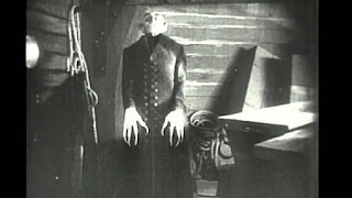
The iconic scene where Count Orlok raises himself from a coffin.
Another memorable scene from the film,
most known for its appearance in Spongebob Sqaurepants.
However, some conventions in Nosferatu never really caught on with modern vampire or horror films. For example, Count Orlok is portrayed as being hideous and having a skeletal figure with long fingernails and a bald head. In modern times however, vampires are portrayed as suave, cunning, handsome, and overall attractive. Additionally, vampires today are shown to be able to turn others into vampires, while in Nosferatu Orlok simply kills people after he sucks their blood. The Count is also able to spread disease in this film, while modern vampires don't. Also, in Nosferatu it is shown that Count Orlok has some association with rats, while modern vampires are usually associated with bats, and may even be able to transform into them.

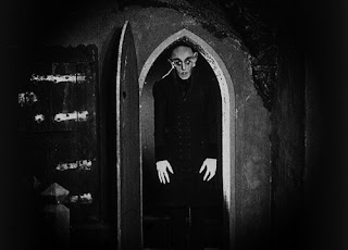
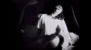
The film also uses chiaroscuro lighting heavily, where lights and shadow are starkly contrasted. Despite being used in many scenes, only some scenes have succesfully used it to create a unique effect, particularly the scenes where Ellen gets attacked by Orlok.
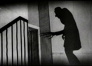
Orlok entering Ellen's room

Ellen after being bitten by Orlok
In both scenes, there is a clear contrast between the blacks and the whites. This accentuates a feeling of dread and mystery within the scene. It may also create a feeling where the darkness takes over the light, or that evil has triumphed over justice. This form of lighting also contrasts the scene right after, where Orlok gets killed by sunlight.
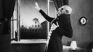
While the previous scenes have stark contrast between whites and blacks,
here the contrast is much more subtle.
F. W. Murnau was an apparent homosexual, and this was exaggerated in the metafictional adaptation of Nosferatu's production, Shadow of the Vampire.While not shown directly in the film, some aspects may allude to his repressed homosexuality. For example, Orlok's lust for Ellen may have represented Murnau's feeling of frustration and restraint. In the film, Orlok lives in a castle isolated from civilisation. Orlok's isolation may also represent Murnau's feeling of loneliness. It is also interesting to note how Orlok interacts with Hutter. When Hutter first arrives at Orlok's castle and cuts himself during dinner, Orlok suddenly and forcefully tries to suck his blood. In fact, during the whole dinner scene Orlok is shown to simply be watching Hutter as he eats, while seemingly reading papers. Finally, while Orlok usually kills his victims including the ship captain ultimately Ellen, Orlok leaves Hutter alive. This may be hinting that Murnau is inserting part of his personality into Orlok. Orlok is also shown to have interest in Ellen, but when he actually meets her, Orlok only wants her blood and kills her. This could show how Murnau has desires to be with people, but in different ways than most would expect.

Nosferatu is considered to be a legendary film for its time, inventing some conventions that horror films would follow today. While it may not seem as terrifying compared to modern horror films, it does set a great example of a classic vampire film, and is still entertaining even today.

Sources
www.slideshare.net/lalaland_xo/horror-film-forms-and-conventions
http://study.com/academy/lesson/gothic-novels-characteristics-examples.html
http://eric.b.olsen.tripod.com/nosferatu.html
http://www.liquisearch.com/nosferatu_word/origins_of_the_name
https://news.artnet.com/market/art-house-an-introduction-to-german-expressionist-films-32845
http://tvtropes.org/pmwiki/pmwiki.php/Film/Nosferatu
https://www.academia.edu/5328269/Murnau_and_the_Evil_of_Sexuality_A_Look_at_Nosferatu_and_Sunrise
https://pinoy-comics-tv-movies.blogspot.sg/2010/01/filipino-boy-and-death-of-murnau.html

Friday, September 30, 2016

Year 11 Term 1 - Passing the Salt

The first project we did this term, and therefore this year, was a short practice exercise called 'Pass the Salt'. During this exercise, we practiced about not crossing the '180 degree line', as well as the different roles, such as the cameraman, director, assistant director and actor. The basic premise of the film would be about 4 people eating at a table, and asking and passing the salt around.

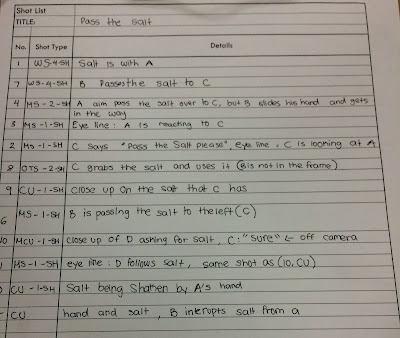
The first step we took in making the film was planning and storyboarding. During this step, we as a class created the 'story' and shot types, as well as considering the genre of the film. The storyboard we created included 12 shot types.


The storyboard draft (top) and final version (bottom)


The first draft was drawn on a whiteboard. We later transferred each panel onto sheets of paper and continued from there. After we finalised the storyboard, we created a shot list to know which order we would shoot in to make filming easier. We also deviated from the storyboard a bit, and changed the last shot where C passes the salt to D. We made it so that C drops the salt and D gets upset about it, filmed that from two angles, and added an additional shot where A and B look at each other awkwardly. We decided to shoot everything in order of wideness, with wider shots being done first, midshots in the middle, and things like closeups done last.


After we completed the shot list, we decided on a place to film. We needed to film in a place with a projector since we wanted to connect the camera to the projector so everyone could see the footage more easily. We considered shooting in MPR (multi purpose room) 1, however we decided not to because the lighting was bad and wouldn't be able to connect to the projector in that room. So, we instead decided to shoot in one of the classrooms in the library.

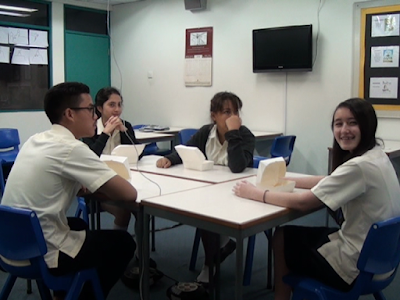
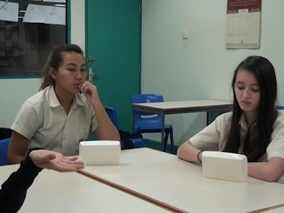
Shooting took a total of two lessons, or two hours. While we were shooting, we each had to rotate between director, cameraman, assistant director (who managed the slate and shot list), actors, and being idle. Because we had to rotate actors, it created inconsistencies in the clips. 

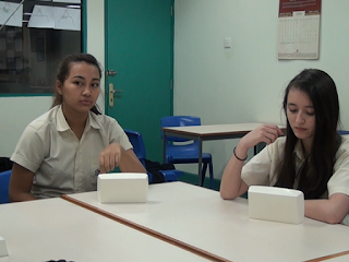
The establishing shot with Sam and Shila as A and B respectively...
...but later becomes Shila and Shona as A and B in the final shot.
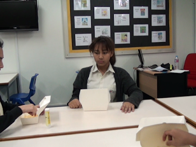
For equipment, we used one Sony camera, a tripod, dolly, and of course a projector, We didn't need any boom mics because it was a small project and the camera's own microphone was able to pick up the sound quite easily. When we were about to get ready for the shoot, we realised we had the french fries, yet we forgot to bring the titular salt, so we ended up using a glue stick with the word 'salt' stuck to it. Also, production took two days, and on the second day we forgot to bring the fries, so we had to disguise the containers to look like they were boxes of fries. Since we were shooting in limited space, it was sometimes difficult to do wide shots since we couldn't walk out any further and were constrained to the walls of the room. For example, the shot where Sam passes the salt to Sebastian but was intercepted by Shila could have had Sam and Sebastian within the frame, but because the room was quite small we could only get Shila and Sam partially in the frame.

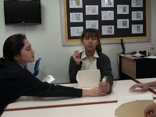
In this shot, we originally planned to have only Sam (A) and Shila (B) in the frame (storyboard panel 4), however we decided it would make better sense if we included Sebastian (C) as well. Unfortunately, we couldn't get them all in frame due to space limitation.
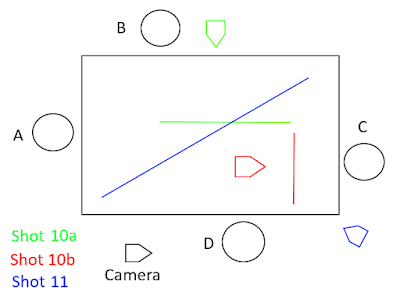
Since the practice was supposed to be about the 180 degree rule, we needed to go around the table circularly to get everyone in. But, there were times when we actually did break the 180 degree rule, such as when C passes the salt to D and the camera looks at A and B.

Camera positions and 180 degree lines in shots 9-11
Shot 10a
Shot 10b
Shot 11
We can see that shot 11 crosses the lines of both 10a and 10b, therefore breaking the 180 degree rule. However, we concluded that despite crossing the line, it still makes sense because we already know the spatial relationship between A and B and C and D. The audience still maintains the orientation of characters from the backgrounds of the shots, even if the characters themselves have switched roles.

After filming, we realised that we forgot to shoot shots 2, 5 and 7. Looking back, we realised that those shots were combined with others. For example, shot 5 was supposed to be a close up of the salt being passed from A to B, but it was integrated into shot 4.

This was supposed to be a close-up on the 'salt'.

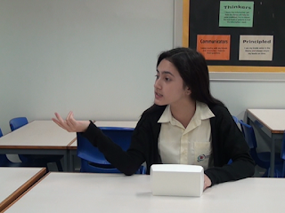
Most shots only took 1 or 2 takes, but shot 10, the shot where D asks for the salt, took 7 takes. We decided to change the story somewhat by adding more dialog and some acting. The shot ended up having D (Sam) getting suddenly upset and frustrated at C (Sebastian) for dropping the salt, and C acting like he doesn't care.

After we completed shooting, we all had to edit the piece individually. We were allowed to choose the genre, music, sound effects by ourselves. I decided that I would make the genre be suspenseful. I decided to keep the entire film keep the sound but add suspenseful music when D gets frustrated. I also considered adding some subtle salt shaking sounds. For my edit, I decided to make it so that shot 10 switches angles whenever needed, such as to show Sebastian's indifference when he drops the salt and then cut back to Sam. I will be editing the piece in Adobe Premiere Pro.

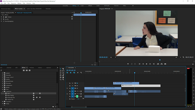
Editing the piece together in Premiere Pro. I had to synchronise the audio between the two clips to see where each action happens.

In the end, I decided to put the music throughout the whole video, but at a quiet volume which goes up as the video goes, and suddenly become more tense when Sam asks for the salt. The music I used is "Seeking the Truth" by Greg Noblin.

While trying to come up with an ending which is not too abrupt, I ended up expanding the last clip where Shila and Shona look at each other. I played the clip again if I could use something from that clip for the ending, and noticed that the music got cutoff right when the director says cut. I thought it would be an interesting twist if the video ended like that, so I left it so. 

In the end, I exported the project in the H.264 format at 25 fps. Rendering took ~1 minute using CUDA hardware acceleration. The final product can be watched here.

Wednesday, August 31, 2016

Year 11 Term 1: Independent Research - History of Technicolor

In a previous post, I mentioned how I was interested in the history of Technicolor. I have done my own independent research on the topic, and here's what I found.

The Technicolor Corporation was founded by Herbert Kalmus, Daniel Comstock and W. Burton Wescott, to develop a "flicker free" movie color system. The word "Tech" in Technicolor actually came from Kalmus' and Comstock's association with the Massachusetts Institute of Technology.

Technicolor’s first color process was a two color additive system that recorded red and blue-green images simultaneously. It did this through a single lens using a beam splitter and color filters to record the images stacked one on top of the other. Their first camera, the Technicolor Process 1 was made in 1916. The first and only movie made using this process was ‘The Gulf Between’, produced in 1917.

Technicolor System 1 - Photography Illustration
How video is captured through the Process 1 camera.
Technicolor System 1 - Projection Illustration
How the video is projected. Note how it requires a specialised projector
as well as manual adjustment of the prism to get both colours aligned.
Images above are taken from www.widescreenmuseum.com.
A surviving still from The Gulf Between.
Image taken from America Pink
Technicolor’s second innovation was the Process 2 in 1922. Unlike its predecessor, Process 2 uses subtractive color. This made a huge difference in overall color quality and also made it easier to project the colors on screen. Additive systems used a black and white image projected through color filters, resulting in loss of the light absorbed by the filters. The film strips were also able to be played on normal projectors, unlike in Process 1 which required specialized projectors. The first film to be shown in Process 2 was “The Toll of the Sea” produced in 1922.


Technicolor System 2 Camera Optics
How the Technicolor Process 2 camera captures video.
Image taken from www.widescreenmuseum.com.
The camera negative carries both the red and blue-green records of the scene. The blue green record is upside down to the red record, and two separate prints are made on matrix films that are half as thick as standard matrix films. The red and blue-green matrices are printed as mirror images because they need to be placed back to back after dye application, which is also why each matrix are half the thickness of standard matrices.

From Left to Right: Camera matrix, red filtered matrix, blue-green filtered matrix.
Image taken from www.widescreenmuseum.com.

After Process 2 came Process 3, which had similar technology to Process 2, but mostly used in a different way. The camera used was the same, but instead of producing a duplicate negative that generated the matrices that would be dyed and cemented, the matrices were optically generated from the camera negative and were used to make other prints. This process eliminated some problems with Process 2 and used the matrices to transfer dye to a specially prepared clear base film. Process 3 received critical acclaim and Technicolor's output increased from 1928 through 1930. The first film to use Process 3 technology was The Viking, produced in 1928.

The Viking
A still from The Viking (1928), the first sound film produced in Technicolor.
Image taken from www.widescreenmuseum.com.
In 1931 Technicolor went on to develop a three strip camera that would be able to capture red, green and blue rather than only red and green and to refine the dye transfer printing that had been introduced in 1927. In 1932 the first 3-strip camera was completed, becoming known as Process 4. The first commercial film to use the 3 color system was Flowers and Trees, produced in 1932, by none other than Walt Disney. 

The Technicolor Process 4 three-strip camera.
Image taken from the-culture-counter.com
How the camera worked.
Image taken from www.widescreenmuseum.com.
Flowers and Trees Frame
Flowers and Trees (1932). Produced by Walt Disney.
Image taken from www.widescreenmuseum.com.
Later on, Becky Sharp, produced in 1935, was the first live action film to be recorded in 3-strip Technicolor.
Comparison between Becky sharp in the inferior Cinecolor (left) and Technicolor Process 4 (right).
Click to zoom in.
Technicolor's 3-strip film process ended up becoming a huge success and raised the standard for color film in the industry. Their innovations have been used to create hugely successful films such as The Wizard of Oz (1939), Snow White and the Seven Dwarfs (1937) and more. While films now are much more sophisticated and do not require 3-strip film to record colour, some films try to recreate the look and feel of these old colour technologies in post-production for reasons such as achieving the early 20th century look. Without Technicolor, films probably would have taken longer to reproduce natural colours, and maybe colour films would decline in popularity during those days.

Sources:
http://www.widescreenmuseum.com/oldcolor/technicolor1.htm
http://www.infoplease.com/cig/movies-flicks-film/condensed-history-color.html

Year 11 Term 1: History of Film

A new school year has begun, and so has a new year of film studies. We started our first film class in the DP by watching a presentation about the history of cinema from the early 1900's. We learned how much film has evolved over the course of a century and what technologies and innovations defined films we see today. While watching the presentation, we each learned some new things. The 5 main points which I found the most interesting are mostly in the form of technological innovations within the films themselves.

To start off, of course the most interesting thing I found out about was the earliest form of film, or back then was known as a motion picture. I learned that the earliest form of film was known as a "motion peep show" created by Thomas Edison and W. K.  Dickson. It worked by moving pictures through a light, and was only view-able by a single individual at a time. The other name for this device is the "Kinetoscope".

The kinetoscope, image taken from Reflexions ULg
The next point I found interesting was when the Technicolor company was formed in the late 1910's, which offered some groundbreaking new innovations in colour technology in films. Later on, they would be the first company to offer a full spectrum of colour in films. I ended up researching more about the history of Technicolor individually, which I will discuss in the future.
The Technicolor Process 4 three-strip camera, the first capable of
recording a full range of colour instead of the usual red and green at the time.
Image taken from www.the-culture-counter.com.

Next, in the 1920's, sound started appearing in films. However, back then, sounds were not directly "attached" to the video, and had to be synchronised manually. One such film was Steamboat Willie, a short created by Walt Disney featuring Mickey Mouse. This short ran for about 7-8 minutes, and is notable for debuting the Mickey Mouse character to the public.


Jumping to the 1970's, Dolby Stereo was introduced, producing sound with the effect of being all around the viewer(s), allowing them to have a sense of positioning of the source of the sound. While Dolby Stereo wasn't the first form of stereo, it was important because it was backwards compatible with traditional theatre speakers.

And finally, the film Casper was produced in 1995. This film is notable for having a fully CGI (computer generated imagery) character play in the main role. The film was directed by Brad Silberling.

Christina Ricci as Kat, the protagonist of the film,
and Casper, voiced by Malachi Pearson.
Image taken from Buzzfeed.com.
These are the 5 things I found the most interesting in the history of film, because it makes us wonder how films will continue to evolve through technological innovations. While it seems that films now are as lifelike as ever, with full and accurate colour, surround sound, HD video formats and realistic CGI, they can and probably will continue to improve in the future. My guess is that films may start getting into VR (virtual reality) technology, putting the viewer inside the film in a 3D environment, creating full immersion. While it sounds crazy now, it may become the norm in a decade or so. Personally, I found the history of film to be an interesting and exciting topic. It really is fascinating seeing how films started out as short moving pictures to becoming immersive, expansive stories that can really take the viewer into another world.

Tuesday, May 31, 2016

Term 4 LiaD Trailer and BtS - Production

The Plan
Our plan for the behind the scenes was to interview different people. We wanted to follow kind of a BuzzFeed format where people are interviewed in front of a green screen while providing not too long answers. At first, we wanted to include everyone's answers for each question, but since we interviewed so many people we had to cut it down. At that point we decided to select what we feel are the best answers for the questions.

The Shooting
Since we had to interview different people, and the fact that we had to book the studio and equipment and whatnot, it was a pain to get everything and everyone together and we struggled to follow our schedule. In the end, we ended up interviewing a total of 12 different people. The equipment we used was a camera, tripod and 2 LED lights. Minkee and I were the cameramen and Fajar was in charge of asking the questions. I also helped set up the lights and provided the SD card. Minkee and Fajar helped set up the rest of the equipment. On some shoots, one of us could not make so we sometimes needed help from the interviewees to setup.

On our very first shoot, there was a second camera available on the set. We decided to use that as a prop to give the scene a more 'behind the scenes' feel, and to help construct the image that we are film makers. However, the camera did not appear again in subsequent shots and thus we had to live with a continuity error. We can try to edit it out in post production if possible, otherwise we'll have to let it slide. Another continuity error we found is that in some shots the table has a green cover while in others it doesn't. This one we can't really fix without putting a lot of effort because of the shadows and arm covering.

Camera present on desk
Camera not present on desk
Table cover present
We think the lighting is OK but in order to really use the green screen we have to get it to be more consistent and have lighter shadows. We also think the sound is a bit 'echo-y', but it's not much of a problem.

We also had to reshoot some people a few times because of a few reasons. Some people weren't satisfied with their answers, and some needed to reshoot because of lighting errors or other things. Some also needed to reshoot because we came up with an extra question ; "Why should people watch it?" to get the audience more interested to watch our Life in a Day.

Aside from the interview shoots, we also shot scenery from around the school to use as filler footage and maybe cutaways, but our main purpose for them is to blur them out and use them as the background for intertitles. However, after looking at them, we think some of the clips can't make it.


The Trailer
We have looked at several trailers to give us inspiration to make our own. The first one we looked at was the original Life in a Day Trailer.


One of the things we decided to follow from this trailer was the jump cuts from different scene to different scene, like in 0:22 to 0:30, but instead of going from random scene to random scene, we want to make each scene connect to each other, but from the perspective of different people. For example, we want to show someone waking up, then cut to someone else brushing their teeth, then to someone else having breakfast, etc.

Other trailers we looked at included the Captain America Civil War trailer and the X-Men Apocalypse trailer if we wanted to go the "action" route.

In the end we were satisfied with what we did so far. We think the interview shows a bigger picture of people's opinions on the documentary. We believe most people answered truthfully, but some may not really have. We now have to face possibly the most frustrating and intense process of film making: post production.

Monday, May 9, 2016

Term 4 - Entry 1

At the beginning of this term we watched a short film called "7:35 De La MaƱana" (7:35 in the Morning) and had to analyse it and writing the information on a timeline. The story is about a woman who goes to a cafe as part of her daily routine, but the usual atmosphere of the cafe is different. 
Unlike usually, everyone is quiet; and when she sits down with her food, people start glancing at her. Suddenly, a man starts singing and dancing and the rest of the customers join in, seemingly against their will.
We watched it bit by bit, analysing the setting, characters, mood and story. This took a few lessons, and right before we reached the end we had to make a prediction of what the ending will be like.
In the end, it turns out the man was a suicide bomber who wanted to confess his love to the woman. The police arrive on the scene, and the man goes outside with a bag of confetti and blows himself up. The camera cuts to the woman's shocked reaction, and the credits roll.
One thing to note about this movie is that it is in black and white. We discussed how the lack of colour adds to the mood, and the class agreed it helped make it feel like something unusual. There was also a lack of background music which, again, added to the mood.

Moving on from there, we later decided to start some work regarding the term 4 project. We formed groups and were allowed to choose between 3 different topics: Making a documentary of our choice, making a trailer for last term's Life in a Day, or making a tutorial for the Year 9s to promote the Film Studies subject. My group, me, Fajar and Min Kee, decided to create a trailer for our Life in a Day documentary. In our trailer, we also have to include a 'behind-the-scenes' clip where we interview some people involved in the creation of the documentary (aka our Film Studies classmates) and some of the audience who watched the finished documentary.

The questions we will be using for (most of) the interviews are:
- What do you think of the finished life in a day? 
- What inspired you to make your segment the way it was?
- What challenges did you face whilst making your segment? 
- What were you most proud of/what did you like the most of LiaD? 
- Would you have done it any other way? 
- What do you think life in a day means? 
- Rate it from 0-10 
- How would you describe it in one word?
- Why should people watch it?

A very basic sketch we used as a storyboard.

Our Timeline for the project:
Week 3 (April 18-24): Storyboarding and Planning
Week 4 (April 25-May 1): Test shots
Week 5 (May 2-8): Principle shooting of interviews
Week 5-6: Assembly editing
Week 6 (May 9-15): Re-shoots if needed, otherwise start post production
Week 7 (May 16-22): Post Production
Week 8 (May 23-29): Exams
Week 9 (May 30-June5): Post production
Week 10 (June 6-12): Final Edits, export movie then showing at Arts Assembly on June 10

We chose to make the trailer because we have learned the concepts on how documentaries are made and what role they play in the film industry. This allowed us to better understand what we want to do. Since we want to show our daily lives to other people, we want the trailer to show a smaller glimpse of that part of our lives. We chose not to make our own documentary because it feels too ambitious. We also chose not to do a tutorial because we thought it would be more interesting for us.

We started shooting on Tuesday, May 3. The location of our shoot was the News Production studio. We chose this place mostly because it is near to where the equipment is stored, it is isolated, and most importantly, it's a studio. Because the studio had a green screen, we decided to experiment with it.


However, one problem we faced was that the shadows and lighting were unbalanced and created visual artefacts in post production during our testing. Because of this, we decided to either leave the background green or change the colour, where the artefacts are less visible. Since we wanted to make the clip look like it was taken in a studio, we are considering leaving the green colour. This also explains why we left a redhead light and camera in the shot.


Despite this however, we are pleased with our current footage and we will continue shooting this week. We do realize we are running later than what we had intended in our timeline.

Sunday, April 10, 2016

Life in a Day - Entry 4: Evaluation

Looking back, I had the potential to do more in my segment. I could have shown more parts of my daily life, and I could have used different shots and techniques. I also think I could have done more in the post production of my segment, such as colour grading. During the part where I opened my laptop, I could have instead shown a screen recording of it rather than physically filming the display to show a clearer view of what I was doing.

In my segment, I was acting more of a director rather than participant because I filmed others more than I filmed myself. I think it's easier to be a director because you have much more control over your actions and you know what you want to shoot, whereas being participant requires someone to film you and it may be difficult for you to get your ideas across to them. Also, in the context of this documentary, when being the director you can really just record anything and let anything happen as long its not something extraordinary, since you're supposed to show your daily life.

In my opinion, I think Ershad had the best segment technically because he used a variety of shot types and techniques to show different aspects of his life. In my honest opinion, none of the segments strike me as very aesthetically pleasing. Some clips look better than others, but I honestly don't have a favourite. However, my favourite segment overall has to be Fajar's. While I find some if it unfitting for a documentary, the humour is actually quite amusing. Nonetheless, he still managed to accurately show his life.

The original Life in a Day used minimal editing effects, and I think it's better to have some effects, but not too much. Going back to Fajar's segment, I believe his use of editing effects was a bit over the top, but at least it was funny. I think it would have been better, and more fitting if we used special effects only when needed. I think it was better if we showed the time directly in the filming of our segment rather than in post production.

I have mixed feelings regarding the music used in our documentary. Each piece of music fits with the segment individually, but not with the documentary as a whole. I think it felt weird when we heard one song in one segment, then a completely different one in the next segment, and then silence in another. If we could somehow connect each piece of music together while still making them fit each individual segment, I feel it could work better.

I think I would have done things differently if the audience was different. I would either keep the concept the same and executed it differently, or used a completely different concept. Speaking of target audiences, I think its important for filmmakers to think about their potential audience so that they can catch their attention better and still keep them interested. Target audience is very important in filmmaking because if you didn't know who your target audience was, you could lose potential viewers, or never get them at all. So that is why I think they should think about their target audience.

Wrapping up, I think this documentary was a success. The intro really grabs the audience's attention, and the different segments can really work well together to bring different feelings for the viewers. I just wish to compare our Life in a Day with those from the past years and future years.

Life in a Day - Entry 3: Post Production

During the post production process, I was also tasked with compiling the entire documentary together. As usual, the software I used was Adobe Premiere Pro. I had decided to edit my segment directly within the documentary project rather than on its own, so it wouldn't need to be re-rendered. In addition to my own segment, I also helped edit Min Kee's, Ajez's and Luthfi's segments. I had Ajez and Raihan Y come over as they still needed to finish up their segments, while they also assisted me at the same time.

During this process, we used different production techniques to construct an image of ourselves, and other people. For example, everyone tried to link their segments together using transitions, such as similar clips, or simple cross dissolves. This is most evident between Sebastian and Sasha's clips, where Sebastian ends his clip in his car and Sasha starts her clip in her car.

We started compiling the entire documentary first, and I decided to edit in my segment when the part comes. Luthfi's segment came first. We wanted to incorporate it with the intro sequence somehow, so we just put the segment in first and touched it up a bit. At this point, we still haven't came up with an idea for the intro, so we just left a space between his and Ajez's segment. Speaking of which, his segment was particularly 'fun' to edit because there were so many special effects. We color graded the first and second running scenes yellow and blue, respectively. After Ajez came Min Kee's segment, which also happened to take place at a McDonalds. We decided to transition the two segments using Min Kee's clip of the purple mascot and an intertitle. The rest of the clips was as simple as dragging and dropping them in order and adding transitions such as fades and cross dissolves.


The idea for the intro was thought up by Raihan and Ajez. The song used was "Everybody Loves The Sunshine" by Roy Ayers. We timed the start of the music to the part where the toast came up and inserted the title and introductory credits, which were also timed to parts of the song. In the end, we agreed it worked very well.

As for my own segment, I also just had to drag and drop my footage in the order I wanted it shown. Because I ended up shooting on two different Fridays, and some shots weren't in order, it was slightly difficult to tell which clip goes where. However, I did manage to figure it out. I did not put any special effects because I didn't think they were needed, and I didn't put any subtitles because there wasn't any important dialogue.


In the end, I exported the movie in the H.264 format and set the framerate to 24 fps. The total time it took to export was about half an hour.

Wednesday, March 9, 2016

Life in a Day - Entry 2

After some heavy consideration, I have decided to scrap my hospital shoot entire and instead redo my entire segment in the library, as per my original plan. This was because of 3 main reasons:
The first reason is because I felt that the quality of the shoot wasn't good enough, such as the technical aspects. I felt that the sound wasn't clear, the lighting was too dim, and I could have done better camera work.
The second reason is after discussing with friends about their own segments, I realized mine didn't exactly fit in with the rest. I confirmed this after discussing it with the people who's segments were before and after mine, more on this later.
The final and what I believe to be the most important reason is that it doesn't accurately represent my life. After all, this project is about showing our daily lives and how we normally spend it each day. So, if I had decided to use the hospital shoot as my segment, it wouldn't have accurately represented my life. While it would've been unique, it still wouldn't fit in. I had referred to the Global Context of 'Identities and Relationships' because this segment is supposed to express my true identity and relationships between different people.

This brings us to the re-shoot of my segment in the library. Once again, I didn't exactly follow my storyboard. Instead of filming the canteen and gymnasium, I decided to focus solely on the library since it is what I normally do. For the equipment, I only used my phone's camera. While not the best , I believe it my phone has a quite decent camera. I was able to record at 1080p at 30fps, and even 60fps if I wanted to, but I didn't because I wanted to make it look more cinematic. This was something I learned from an online tutorial. Since I wasn't filming action shots, 30fps was the better option. Another feature present in my phone's camera is video stabilisation, making pan shots and moving shots appear smoother.

For the shoot, my plan went like this:
Film myself walking to the library from first person perspective, show the 'Library' sign, focus camera on watch to show what time it is, enter the library and store bag in locker, take laptop, go upstairs, film what was going on in the library that time. I may considering taking additional shots another day, but these shots shouldn't add any new action that would otherwise conflict with my existing footage.

While I was inside, I had to pause the recording to ask my friends who hung out there for consent to film them. Most of the time, they didn't mind. I ended up getting the footage I wanted, and footage of what usually happens around me in the library during lunch time.

A few days after I finished my shoot, we had to discuss with the people whose segments came before and after our own. After talking around class, I learned that the Benson came before me, but he was absent that day, and Joey came after me. I discussed with Joey about how our segments would have linked together. I learned that her segment started with the camera facing to a clock, and mine ended with me walking away from the library. We decided maybe not to use a transition between our segments. We also agreed that we both weren't using subtitles or music.

In addition to filming our segments, there was some discussion about editing. I had decided to help Minkee with editing since we both aren't using Final Cut Pro unlike the majority of the class. I'm also considering making the intro and credits sequences for the entire film, but I'm still not entirely sure. Maybe if nobody else decides to do it I'll step in.

Overall, I'm pretty sure my shot shows my average life truthfully and accurately.

Tuesday, February 16, 2016

Life in a Day - Entry 1

Starting in Semester 2, we have watched a documentary called Life in a Day. The documentary shows how different people around the world do different activities throughout their day. It takes place on the 24th of July, 2010, from 12 AM in the morning all the way to 12 AM the next day. The film is around 90 minutes long. What's unique about this documentary is that it was a collaborative project between thousands of people around the world with varying skills of cinematography. It mixes a variety of camera shots, angles, techniques, lighting, etc. While there are some inconsistencies between the clips, it somehow flows together quite well, mostly due to the work of the editor and director.

The process of creating Life in A Day was a long one, according to many sources. First they had to come up with a theme to tie everything together. The theme came in the form of 3 questions: "What do you love?",  "What do you fear?" and "What's in your pocket?". There were thousands of hours worth of footage from different countries and the editors and director had to view most, if not, all of them to see which ones fit best. After assembling the video together, they had to edit transitions, effects and music. Finally, they chose to publish it on YouTube. The most likely reason they chose to upload it on YouTube rather than show it in a cinema is so that it could reach a broader audience, because YouTube is the most popular video sharing platform on the internet, and also so people could watch it for free, any time they want.

In this semester, we will be carrying over our skills from last semester, working individually to create our own "Life in a Day". Each student gets an hour of a certain time period to record themselves doing something they normally do, while making it interesting. So far, each student made an oral analysis of a certain scene of choice from Life in A Day. The scene I chose was the ending scene where the woman talks about how dull her day had been. In this project, we will be going through a similar process of pre-production, production, and post-production. This time, however we will also be making storyboards to make production easier.

For my part in the project, I will be recording from 1-2 PM. My initial plan was to shoot during school time, in the middle of a lesson. But after some consideration, I decided against it for a few reasons; It may bother the class, and the teacher may not allow me to shoot at all. So, I decided to shoot during a lunch time on Friday because on Fridays lunch happens on 1-2. After making this decision, I made a simple storyboard.


However, on Saturday, February 13, I was getting surgery on my ear. I realized that I could do the shooting then. So, I made another storyboard in case I could shoot in the hospital.


However, in the end, I couldn't film the surgery, and only filmed myself after the surgery.

After finishing the storyboards, the next thing we worked on was presenting tutorials on either aesthetics or technical skills. In my case, I chose aesthetic because I am confident in my technical abilities in shooting video.

I believe there were some things I could have improved on. The planning stage could have been improved to give a better idea of what I wanted to do. The shoot I did so far also could have better quality, but due to several factors I couldn't make some aspects like lighting, framing and sound as good as I hoped, which is a shame especially since it was a one-time opportunity.